Hi,
I have just recently stumbled on Write.as and subsequently writefreely. Great service serving the purpose of blogging in the right and precise manner, at least to what I have been trying to look for personally. I like it a lot, but there were some aspects that I am not sure I fully understand or find any logical reasoning in them.
I have noticed that writefreely does not necessarily look exactly the same as Write.as when I tested on a local instance vs on the platform Write.as. I probably should have mentioned that I did purchase a year subscription for the pro account Write.as anyway.
As I just mentioned, there are some slight differences between the 2 versions. I understand it might not be an issue for others. Here are some of those differences:
- Menu looks and style are different locally on Chrome and Safari
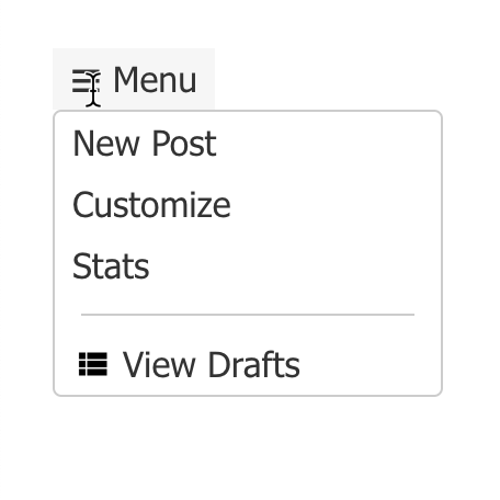
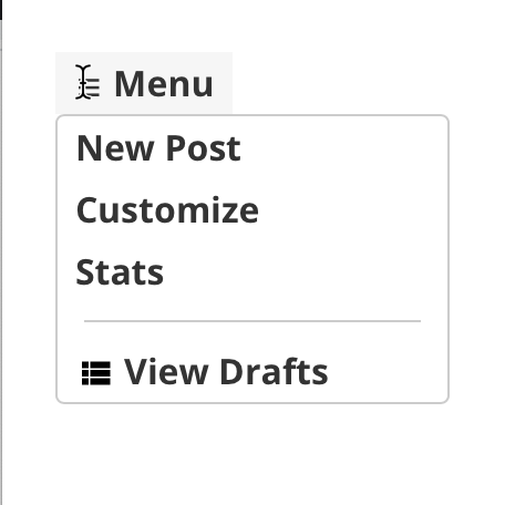
Chrome on the left vs Safari on the right
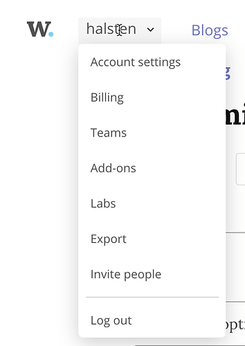
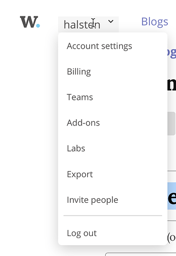
- Menu Looks and style are identical in on Write.as for both Chrome and Safari
Chrome on the left vs Safari on the right
- Home footer for Write.as and writefreely

Chrome on the left vs Safari on the right
- Post footer for Write.as and writefreely

Chrome on the right vs Safari on the left
Here are some other questions as well that I would like to get some answers to:
-
Is there any other differences from the esthetical ones that I have pointed out that I did not notice? If yes, any reason for those differences?
-
Is it permitted that I can modify the footer so that it would have consistency in the text while still preserving the “writefreely” brand and rights and also add my own footer text as well? If yes, could you point out where I would be able to do that?
I am not really a web developer enthusiast at all, but I can manage a little bit. So please try to not assume I would naturally know what is perceived as an obvious step to you.
If someone could maybe shine on these issues a little bit more, I would highly appreciate it.
–halsten
