Something goes wrong with your discuss.write.as UX/UI.
I’m logged in at write.as . I opened discuss.write.as and clicked “Log in”. Then I clicked “with Write.as”. I saw this:
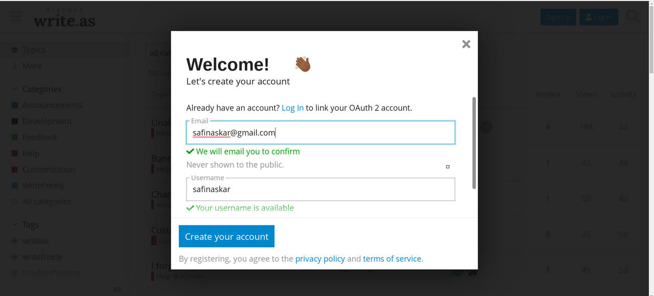
Why I should give this info? I don’t want to create new account, I just want to log in using existing account.
Okay, now I see two clickable things here: “Log in” and “Create your account”. What I should click? I want to merely log in, so I clicked “Log in”. But this opened previous screen! So I got in a loop. So (in the second attempt) I clicked “Create your account” and now was able to get to discuss.write.as .
So, something is wrong. Okay, I understand that I need to provide additional info and perform new registration in any case. But that loop is simply fiasco. I clicked “log in”, because this is most natural variant to me, and that natural variant returned me to previous screen!
I’m paying consumer