Hi
The personaljournal instance I am using is implementing writefreely v0.11.2, If I add pinned items to the top, sometimes they appear wrapped over two lines as per:
Thanks
Is there a way to use the css to fix this please ?
Hi
The personaljournal instance I am using is implementing writefreely v0.11.2, If I add pinned items to the top, sometimes they appear wrapped over two lines as per:
Thanks
Is there a way to use the css to fix this please ?
Hey @PaulSutton! I think what might do the trick is making the font size a little smaller. Here’s a simple bit of code you could add to your CSS that I think will do the trick. Feel free to keep reducing this size until it fits your liking.
.pinned {
    font-size: 15px;
}
Let me know if that works!
Hi, thanks for this
I have dropped the font size to 15px then 13px then down to 10. This isn’t working either.
I was thinking that as that pinned entry is two words, it may be that, but I think the system treats any set of words (title) as a single object. So changed ‘Get involved’ to get-involved (added a hypen) to try that theory out.
So not sure what is going on, for me as I have added a highlight to the link (a.hover) it makes it clearer.
Happy to keep trying things,
Just wondered as the instance is using an older version writefreely v0.11.2 if this may have been fixed, in a later instance,
css for pinned below.
.pinned{
color: #0000ff;
background-color: #ffffff;
font-size: 10px;
font-weight: 900;
text-decoration: bold;
word-wrap: break-word;
}
Thanks, for any further help,
Paul
Hi @PaulSutton, the CSS property you’ll want to use here is white-space: nowrap – this tells the individual links not to wrap the text inside them.
All together, with that .pinned section cleaned up, this CSS should work:
.pinned {
    color: #0000ff;
    background-color: #ffffff;
    font-weight: 900;
    white-space: nowrap; /* Prevent links from wrapping */
}

body#collection header nav {
    overflow-wrap: break-word; /* Allow overall nav to wrap links */
}Hi Matt, thank for for this, works great, I have added to both my blogs now. Looks a lot better.
Regards
Paul
Just to add to this, there is a somewhat unintended consequence for small screens (netbook 10") in that now the pinned entires being in one long line end up going off the side of the screen requiring user sto scroll. So I did some digging and the solution is to use a media query to turn nowrap back to normal
@media only screen and (max-width: 1024px) {
  .pinned {
    white-space: normal;
    background-color:red;
  }
}
Note: background-color:red is there to for testing purposes.
Hope this helps. I am working on a blog post to put all this together so will add a link to this thread once published.
Hey Paul, did you add the following section to your custom CSS, too, as mentioned above? It should fix this issue precisely, and removes the need for the netbook-specific stuff.
Duplicated here:
body#collection header nav {
    overflow-wrap: break-word; /* Allow overall nav to wrap links */
}
Ah, i just added the no-wrap bit, sorry, I will add the other part too.
Thanks
Paul
Another solution would be to use an in the title of the article you want to pin. There might be some fallout elsewhere from that, but that’s precisely the sort of thing that entity is there for.
Hi everyone,
The trick suggested by Matt works great on the home page, and allow the header to be kind of responsive to the screen size, which is great. But once on a article page, the header do not break anymore into multiple lines, which make the header cross the screen size on mobile with an horizontal scroll.
Does anyone know how to fix this ?
Thank you 
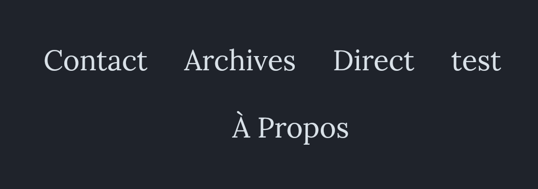
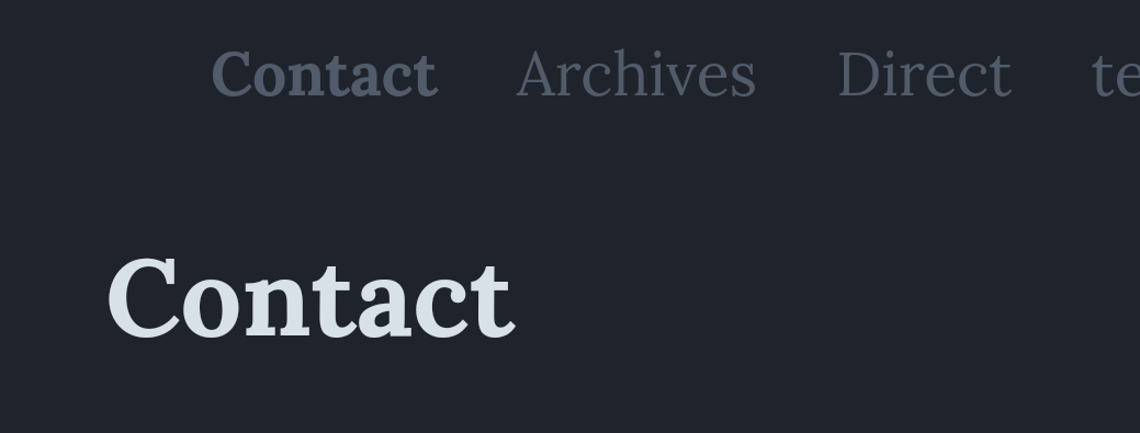
Illustrations:
On the home page ( ):
):
On article page (the header is on a unique line and do not break anymore):
After few tries, I actually found the solution. Simply needed to add the following code and it solved my issue.
body#post header nav {
overflow-wrap: break-word;
}
Hope this helps someone else too.
I can’t edit my previous post which only partly solves the issue. I noticed yesterday that the header wasn’t adapting to the screen size on “tag” page (or what’s denoted as “body#subpage” in CSS).
Thus here is the final code which insure a harmonious (and kind of responsive) header :
.pinned {
white-space: nowrap;
}

body#collection header nav, body#post header nav, body#subpage header nav {
overflow-wrap: break-word;
}
I think the feed can be marked as solved now
Agreed with this, happy to have this flagged as solved, not quite sure how to do that, but there a good few solutions to this issue, which should have serve different requirements from users.