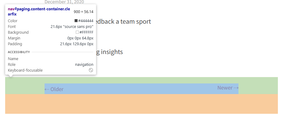
As you can see in the image, “Older” is slightly lower than “Newer” — is there a fix for this?
Also, the links don’t look the same on mobile vs. desktop. For example, on mobile, the links have barely any space between them, which doesn’t look very good, especially given the vertical misalignment.
Thanks!