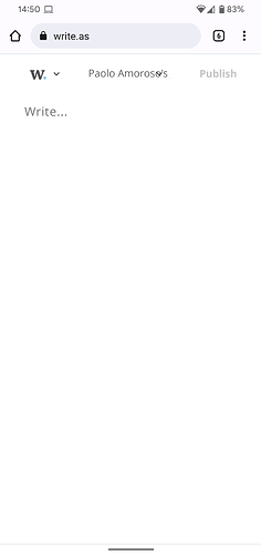
When I’m signed into my Write.as account and visit the New Post https://write.as page on Android, this is what the plain text editor looks like with the screen in portrait mode:
The blog selector Paolo Amoroso's Journal overlaps other user interface elements such as the font selector and the word count readout. I’m using the Chrome 98.0.4758.101 app on a Pixel 4 XL phone with Android 12.
This is only a minor inconvenience though. A workaround is to switch the device to landscape mode, operate the user interface element I need (e.g. change font via the selector), and switch back to portrait mode.
