Can anyone help with some CSS issues? This is specific to the CSS on W.a.
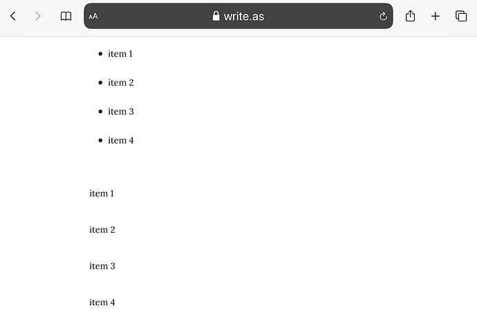
Lists (ul, ol) on W.a have large spaces between the items. I tried with nested divs, but got the same result. I need the list items, or divs, to behave as they would without any CSS. How can I reset the spacing on these elements?
In case you’re wondering what it’s for, I want to use a JavaScript library that makes elements draggable, but these spaces make the items look disconnected.
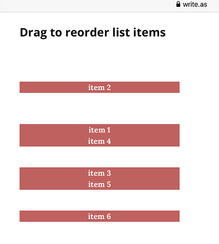
Items eventually group as they are dragged, removing the spaces, but they also create even more space to the elements they have left behind.
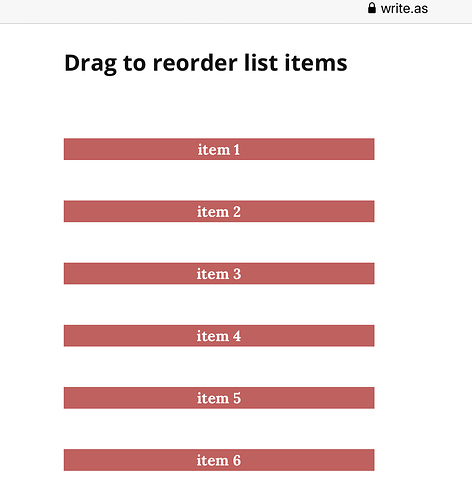
Here are some screenshots using the JavaScript library that have some styling, but that is not the cause of the spaces. The spaces occur on a new W.a blog without any custom CSS.
On page load:
After dragging to reordering:
And here is how it looks on an HTML page without the W.a CSS.
Here’s HTML you can test on your own W.a blog.
<ul id="items">
	<li>item 1</li>
	<li>item 2</li>
	<li>item 3</li>
	<li>item 4</li>
</ul>

<div id="items">
	<div>item 1</div>
	<div>item 2</div>
	<div>item 3</div>
	<div>item 4</div>
</div>
Here’s the CSS used to style the items.
padding: 1px 3px;
font-weight: 600;
color: white;
background-color: indianred;
text-align: center;


