back when I was blogging on github, I used a very pretty theme called “Beautiful Jekyll” that has a feature of adding a cover image to a post, and showing a preview in the main blog’s page with some effects: it’s a circle, it’s grey but shows the true colours on hover, and it’s part of the first paragraph.
It’s a bit hard to explain but here is an example:
I am not good enough at CSS to figure it out by myself, but can this be achieved somehow on a write.as blog?
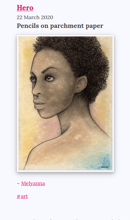
I post art sometimes, and I’d like it to be visible on the main page, but if it’s shown full-size in the main page of the blog it’s a bit “awkward”.
(I don’t want to force users to scroll down a huge image if they are skimming the blog and looking for other posts)
The problem there is that images get stretched to turn round unless the main image is square, which isn’t in most cases with my art.
A “no JS” solution to that problem would be to add two images to the article, a square preview one and the regular one, then hide the one I don’t need with CSS in the collection and main article - but to be honest, it is terrible.
So, for now, I settled with making the picture smaller and giving it a frame:
I added that selector because I realised I have posts where I am actually using a cover image the way it should be used, and I want to differentiate that from the posts that have my art.
My solution was to add a css pseudo class to my art, which I named “art” because I am not very imaginative, so the other ones won’t be affected.
I could have done this also by using HTML when adding images, but i am the type of person that doesn’t like mixing markdown and html.
Here is the tutorial I used:
Basically, whenever I post a picture of my art, I use the following code:

And that
[src*="#art"]
Makes sure that only the pictures tagged as “art” look like that.
I hope I am making sense.
(That tutorial I linked explains it much better)
So it’s not actually filtering the art hashtag. That is a coincidence (or rather due to my lack of imagination).
I could have used another word, such as “thumbnail” - which would actually have made more sense.
I ended up liking the frame effect, so here is the code I am now using, that makes sure the pictures have a frame also when they are inside their own post (but full size):
I second @nibl — the URL fragment trick with CSS is mind-blowing! That opens the door for a lot of interesting possibilities with styling for blogs. Thanks for sharing this @Melyanna!
I don’t think you’re giving yourself enough credit @Melyanna. That’s how a lot of coding works in practice. Stackoverflow is the best example of that. It’s all a remix at some level — just like with art.
The tutorial offers seven different options, which is pretty impressive. I think the one you chose looks like the best option for Write.as themes.