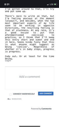
This is somewhat inline with another question I just posted, however, it’s different/separate enough that I figured I would split it off into its own topic.
I recently began using Commento (again), and according to thier site literature, it looks as though customizing the CSS is possible (Frontend · Commento) They don’t cover much on how to even implement it on a blog (the JS needed is posted on a related topic on here, otherwise I’d have been completely lost). Anyways, I was wondering whether there was a way to change certain elements of the comment widget, such as the color of the button (currently blue) via hex code, and the text font throughout, to match what I’m currently using on my site. Additionally, when in use, the widget appears immediately after the last line of text on my entry’s page, leaving it feeling crowded, and I was hoping that there might be a better way of putting a little bit of a buffer between the entry and where the comment widget begins. Maybe similar to the amount of space between the header of my site and where the entry text begins.
This might be a long shot, since I don’t expect anyone on here to necessarily be an expert on customizing Commento, but since it seems like code that’s used within Write.as’ JS/CSS customization fields/page do affect how the widget is implemented, then maybe this is where these other customizations would need to take place.
Thanks, y’all!
