Hello!
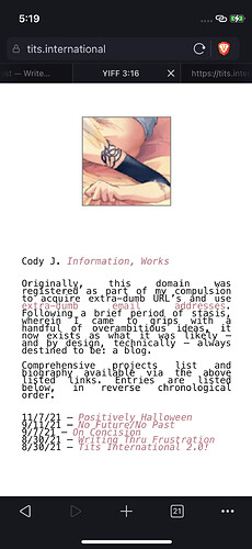
Just wondering whether I might be able to adjust the width of my blogs content/body/text to a more narrow column-like layout, mirroring the look of that which you’d see when viewing it from a phone, but across all device types and screen sizes. Hopefully this makes sense the way it was phrased. Here’s a screenshot of how it appears on my phone:
While this is only of the main page, I would like this narrower width to be applied sitewide, to individual post pages as well. Thanks in advance for any code/advice on this!
Cheers!

 )
)