A letter to Ange and TeDomum regarding the screen width on the Reader view of TeDomum WriteFreely :
Hello Ange, TeDomum!
Bon jour, and thank you for the excellent service I enjoy with the Write.Freely instance at TeDomum.
I wanted to write to you and ask a question – regarding the displaying of pages in the instance.
From the very beginning of my usage of WF, I tried to understand how it displayed pages and images, and realized that it defaults to a 640 pixels wide column on my desktop or laptop displays.
Since then, I have always resized any images I use to fit that exactly - avoiding on-the-fly scaling, which degrades the image and causes delay. So far it has worked well for me.
When I open the URL of one of my pages directly, for example :
…it will display as created, optimally. Happy author!
However, when looking at my Blog view, the stream of all recent posts : Musings by @rg — TeDomum Write
…then I am dismayed to notice that my careful layout is mangled, since it seems to use a slightly narrower display width.
Sadly, that damages the presentation.
Could I ask you to consider reviewing the CSS for this function? I just took a screenshot (attached) and I do see the image size in a post is preserved at 640p, so no scaling is involved.
However – the spacing on HR dividers is greatly compressed, and in general it seems to use a smaller size font, than the same page viewed directly by its URL.
Here are Two screenshots for comparison.
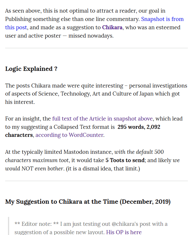
View 1 : a snippet of a post as viewed in the users Blog posts stream.
Noticeably compressed spacing around Horizontal Rulers.
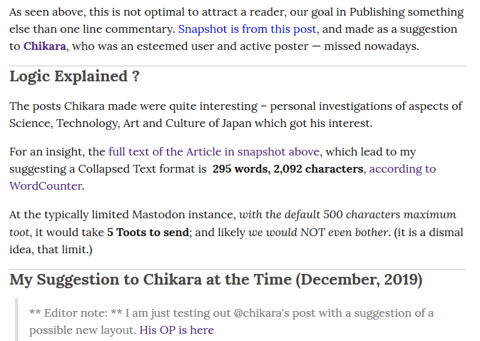
View 2 : the same paragraphs, as displayed directly on the page.